
When you look at a world map, Africa might seem modest in size—smaller than North America or Europe. In reality, that perception is misleading. The Africa we see on most maps is not an accurate representation of its true scale. Here’s why.
The Map We All Grew Up With
Most of us are familiar with the Mercator projection, the standard world map used in classrooms, atlases, and online tools. Although it looks neat and practical, the Mercator projection was never meant to show the world’s actual proportions.
Its original purpose was navigation—helping sailors plot straight-line routes across the seas.
The Distortion Problem
The Mercator projection stretches the Earth’s surface as it moves away from the equator. This means that areas closer to the poles appear much larger than they truly are, while regions near the equator—such as Africa, Indonesia, or South America—appear much smaller.
For instance, Greenland appears nearly the same size as Africa on the Mercator map. In reality, Africa is about 14 times larger than Greenland. This visual distortion has influenced how generations perceive global geography.
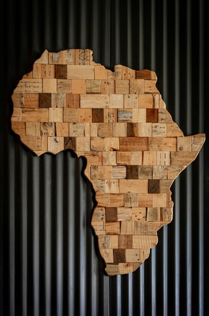
The Real Size of Africa
To put this into perspective: you could fit the United States, China, India, Japan, and several European nations inside Africa—and still have room left.
Covering over 30 million square kilometers, Africa is the second-largest continent on Earth, after Asia. Yet, traditional map projections have long failed to reflect that scale accurately.
Why This Matters
Map distortion is more than a technical issue—it shapes the way people understand the world. When maps make certain regions appear smaller or less central, they subtly affect perceptions of importance and influence.
Historically, this distortion has reinforced a Eurocentric worldview, emphasizing the prominence of Europe and North America while minimizing the Global South.
Seeing the World Differently
Today, many cartographers advocate for projections such as the Gall-Peters or Equal Earth projection, which maintain proportional accuracy and minimize distortion.
The next time you look at a world map, remember that size is not just a matter of geography—it is also a matter of perspective.