
Maps are tools we use every day, from planning a trip to learning geography in school. Yet, not all maps show the world as it really is. One of the most famous examples is the Mercator projection, a map that has influenced how generations perceive the size of countries—but not always accurately.
What Is the Mercator Projection?
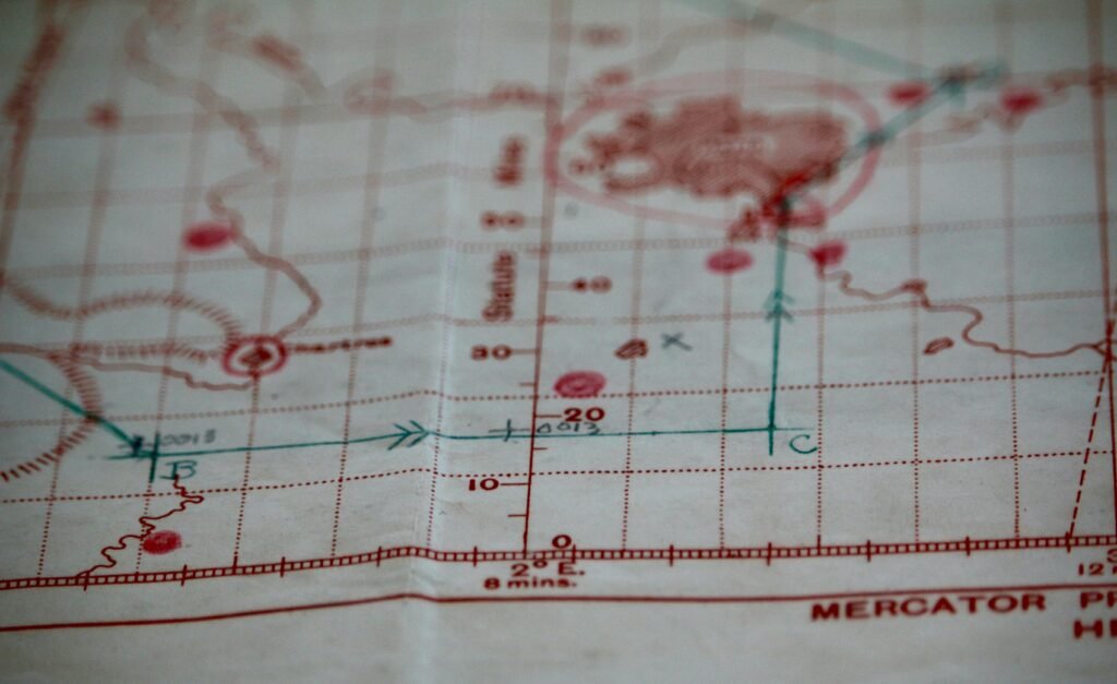
Created in 1569 by the Flemish cartographer Gerardus Mercator, the Mercator projection was designed for navigation. Its primary goal was to make straight-line sailing courses easy to plot on a map. While this made life much easier for sailors, it came with a trade-off: size distortion.
How the Mercator Map Distorts Reality
The Mercator projection exaggerates the size of landmasses near the poles. For example:
Greenland appears almost as large as Africa, even though Africa is roughly 14 times bigger in reality.
Countries closer to the equator, like those in Africa or South America, appear much smaller than they actually are.
This distortion has shaped how many people visualize the world, unintentionally giving more prominence to certain regions.
Why Is It Still Used?
Despite its flaws, the Mercator projection remains popular. Its ability to preserve straight lines makes it ideal for navigation, digital maps, and even classroom teaching—where familiarity often matters more than perfect accuracy.
Are There Better Alternatives?
Yes. Other projections, such as the Gall-Peters projection, show countries in proportionally correct sizes. These maps reduce distortion but can alter shapes, highlighting the trade-off between accuracy in size versus shape.
The Takeaway
Maps are more than just tools for direction—they shape our understanding of the world. While the Mercator map is familiar and practical, it’s important to remember its limitations. By exploring alternative projections, we can gain a more accurate perspective of our planet.