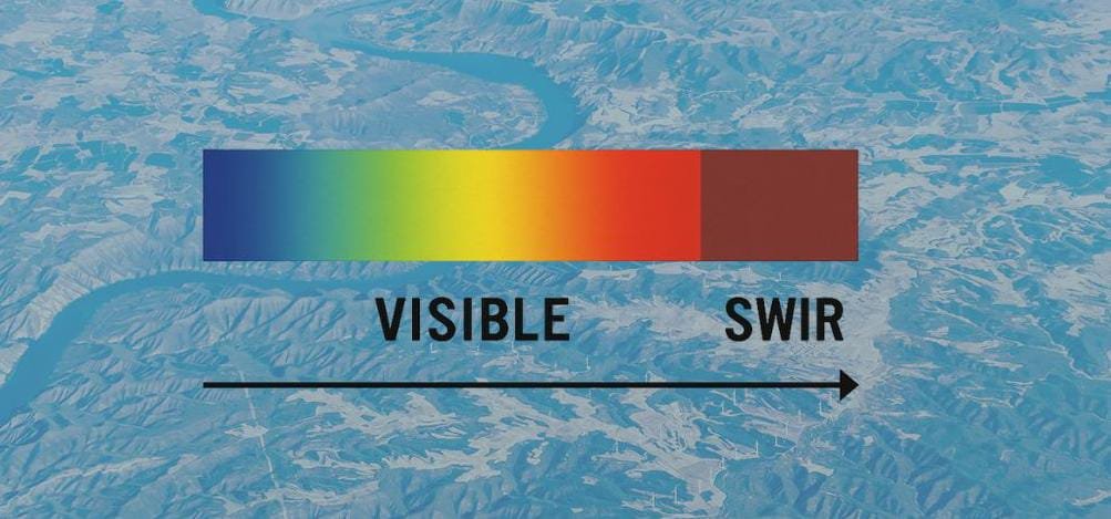
When looking at satellite imagery, the colors you see are not just aesthetic choices—they carry meaning. From red forests to black lakes and orange landscapes, satellite images are powerful tools for monitoring environmental change. But what do these colors actually represent?
Let’s break down the science behind these vibrant visuals.
Not Just a Photograph
Unlike regular photographs, satellite images capture data far beyond the visible spectrum. They use spectral bands, including visible light, near-infrared (NIR), and shortwave infrared (SWIR), to detect characteristics of Earth’s surface that the human eye cannot see. These wavelengths interact differently with vegetation, water, soil, and built environments, allowing scientists to analyze conditions such as drought, deforestation, or urban growth.
Red: Healthy Vegetation
In many false-color images, forests and healthy plant life appear in shades of bright red. This is because plants strongly reflect near-infrared light, a wavelength invisible to humans but essential in remote sensing. When a satellite uses a combination of infrared and visible bands, vigorous vegetation lights up red, helping analysts detect growth patterns, crop health, or ecosystem degradation.
Orange or Brown: Bare Land
Land that lacks vegetation—whether due to agricultural clearing, overgrazing, or natural barrenness—tends to reflect more visible and mid-infrared light. In satellite imagery, such areas often appear in orange or brown tones. These colors can indicate soil exposure, land degradation, or even desertification, depending on the context and location.
Dark Blue or Black: Water Bodies
Water absorbs most wavelengths of light, especially in the visible and infrared parts of the spectrum. As a result, lakes, rivers, and wetlands typically appear very dark—either blue or black—in satellite images. This color signature makes it easier to distinguish between wet and dry regions, track seasonal water levels, or detect shrinking lakes and reservoirs.
White or Light Gray: Clouds, Smoke, or Dry Land
Bright white or light gray areas in satellite images can be clouds, smoke, or even dry, sandy terrain, depending on the combination of spectral bands used. For example, cloud cover is highly reflective in visible light, while smoke from wildfires may appear similar but with subtle differences in texture and context. In arid zones, highly reflective sand or salt flats can also show up as pale areas, particularly in thermal or visible bands.
Color = Data
Satellite imagery is not simply a colorful display—it is structured data that reveals what’s happening on the ground. By learning to interpret these colors, we can:
- Monitor deforestation
- Track water loss
- Assess agricultural productivity
- Respond to natural disasters
- Plan sustainable development
Understanding what each color represents empowers individuals, researchers, and decision-makers alike. The next time you see a satellite image filled with reds, blues, and browns, remember: those colors are telling a story about our planet. Read the colors. Know your Earth.
