
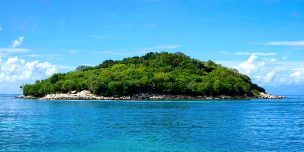
Maps are designed to make sense of the world. They reduce oceans, mountains, and cities into measurable forms — clean lines, defined colors, and precise coordinates. Yet in doing so, they inevitably leave something out: the feeling of being there.
In a map, a mountain range is nothing more than a cluster of contour lines. In reality, it is a wall of stone, mist, and silence — a landscape that overwhelms both sight and sound. A river, drawn as a single blue curve, hides the roar of water and the generations who have lived along its banks. A city grid on paper cannot convey the pulse of life that fills its streets from dawn to night.
The more we rely on maps to understand, the easier it becomes to forget that they are interpretations, not the world itself. They offer structure, not experience. Perspective, not emotion. Precision, not presence.
When we look at a map, we see boundaries, routes, and names. When we step into reality, we find texture, imperfection, and meaning. This contrast between abstraction and experience reminds us that exploration begins where the map ends.
The project “Map vs Reality” was created to visualize that tension — pairing cartographic simplicity with real-world imagery. Each comparison invites a pause: to see how the flat becomes dimensional, how a symbol transforms into life.
Because every mark on a map hides a world waiting to be seen.